Overview
As the Placements.io platform evolve, it became increasingly important to maintain a consistent style and visual language across all areas of the product. With multiple product lines, it was clear that we needed more systematic ways to organize the UI elements and guide the usage of them.
The initial outcome was to have a collection of reusable components, guided by clear standards, that can be assembled together to quickly build any number of consistent experiences.
MY Role
Lead Designer | Team: 1 Designer, 1 Engineer
Research, Information Architecture, Interaction, Visual design, Prototyping
Research, Information Architecture, Interaction, Visual design, Prototyping
Duration
Sep, 2020 - Mar, 2021

The Problem
As an early stage start-up, Placements leveraged one of the most popular UI framework Bootstrap to define the front-end experience as well as the overall look and feel of the product. This allowed the engineering team to ship quickly and without worrying too much on the visual details. However, over the 3 years of development, many customized components were introduced to the platform, resulting in inconsistent UI and experience.
33%
of the Github tickets are related to an effort to make UI uniform, on ad hoc basis.
14%
of the clients complain that the platform is overloaded with information and looks obsolete.
The Goal
1. A Design System
The primary goal was to develop a design system guided by principles and best practices. Also, to keep with documented at each step to ensure consistency and efficiency of work.
The primary goal was to develop a design system guided by principles and best practices. Also, to keep with documented at each step to ensure consistency and efficiency of work.
2. Customization
To solve the problem of complexity it was important to eliminate any unnecessary elements. To achieve that, the platform should be able to be customized per role/persona.
The Challenges
1. Get people on board
A Design System is not a one-person project, you need to get the team's buy in and support. Getting people on board can help me to plan and prioritize the tasks.
A Design System is not a one-person project, you need to get the team's buy in and support. Getting people on board can help me to plan and prioritize the tasks.
2. Buy vs. Build?
To innovate faster as a start-up, we always try to avoid spinning too much time on reinventing the wheels. To take the opportunity, the engineering team also wanted to move fully to React framework. So I spent time evaluating some existing React UI framework and made prototypes as POCs.
To innovate faster as a start-up, we always try to avoid spinning too much time on reinventing the wheels. To take the opportunity, the engineering team also wanted to move fully to React framework. So I spent time evaluating some existing React UI framework and made prototypes as POCs.
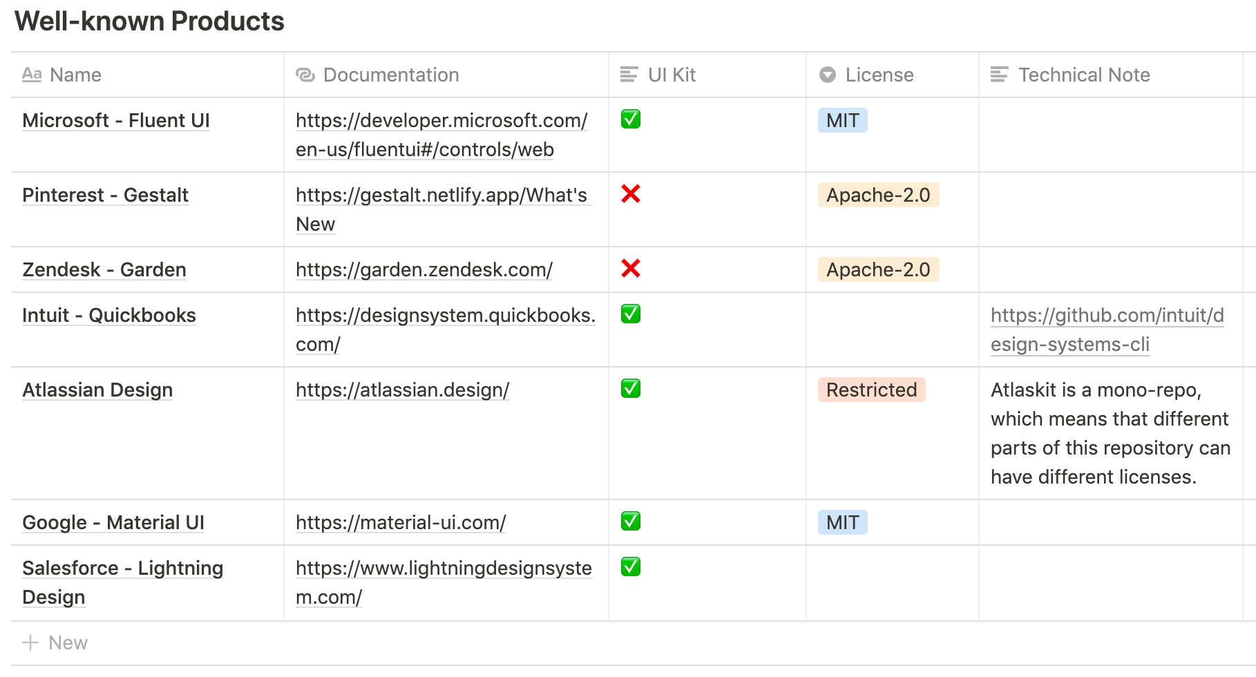
Ant Design
Shopify Polaris
Set the foundation
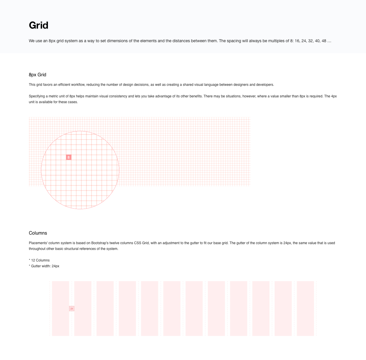
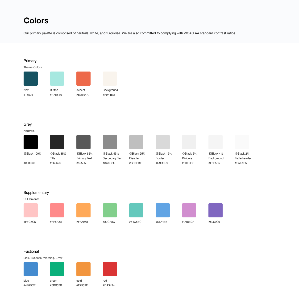
Following the principles of atomic design, I decided to set the foundational parts of the system firstly. This foundation loosely defined our typography, colors, spacing, navigation, and information architecture.
What's more important is the foundation forms the new brand image, and we want to make sure this demonstrates the company's personality - Bold, Innovative, Whimscal
So I started a round of explorations in various directions.
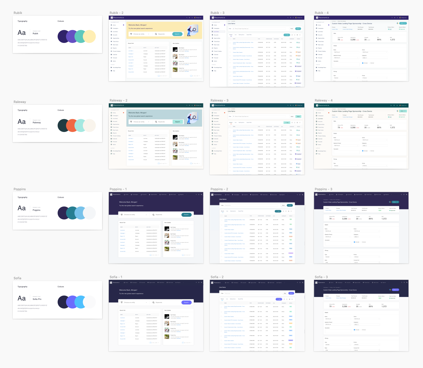
Explored 4 different color, font & layout combinations to have a feel of how the end results will look like
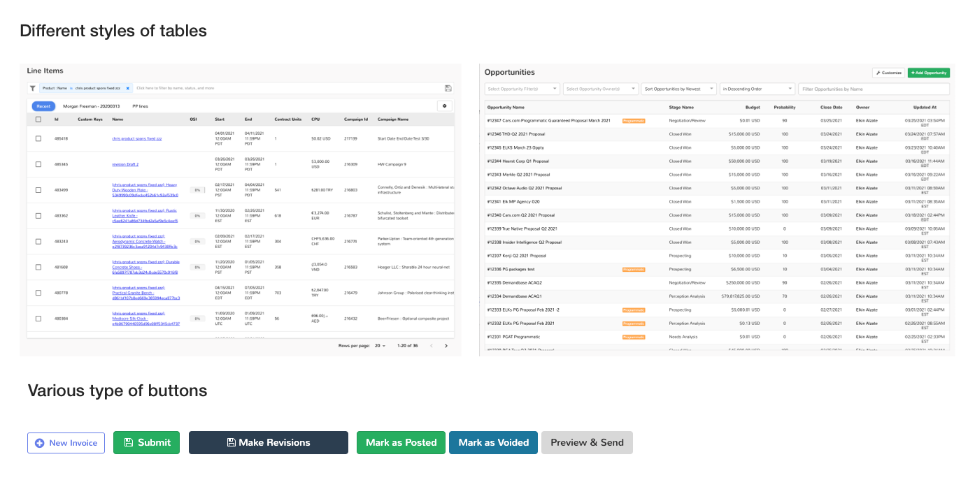
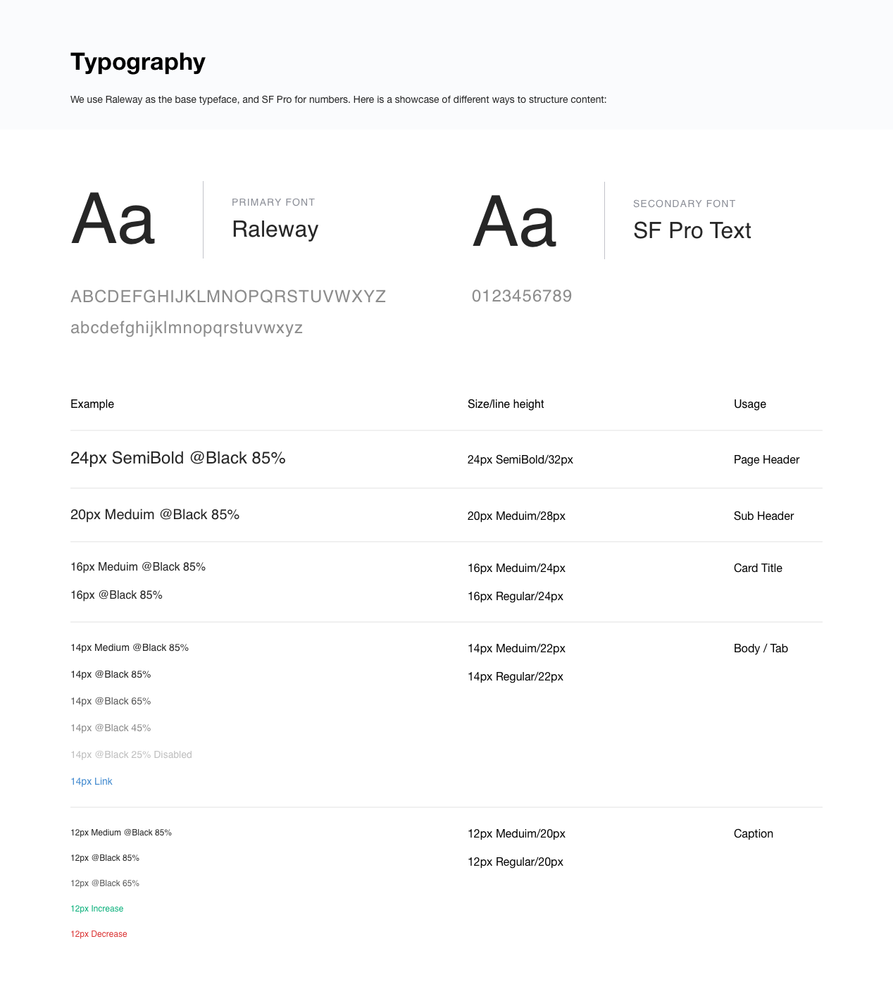
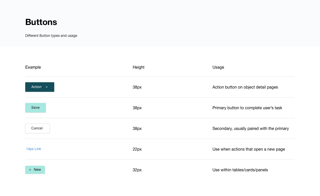
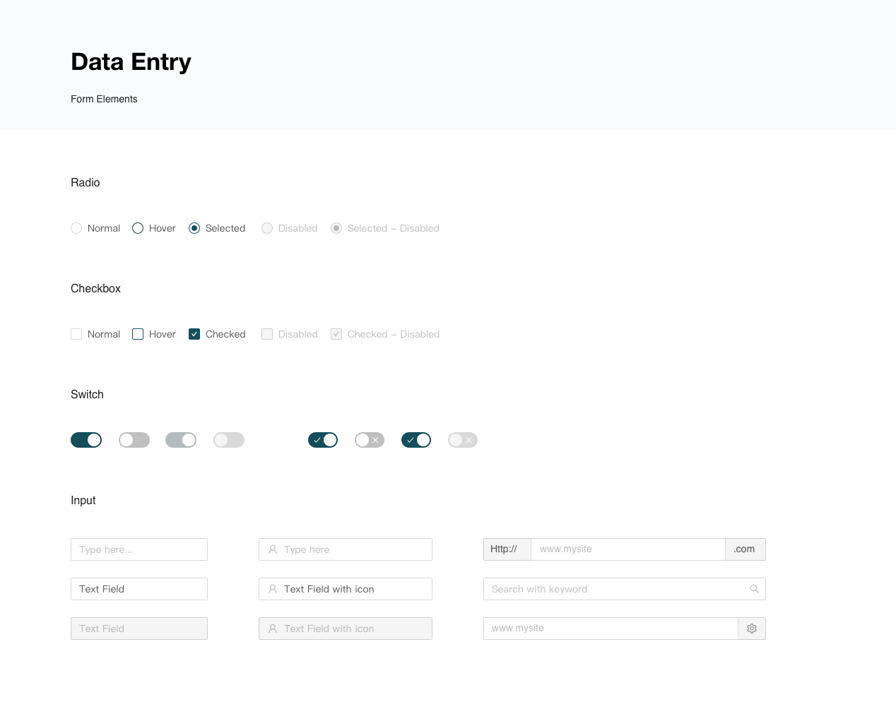
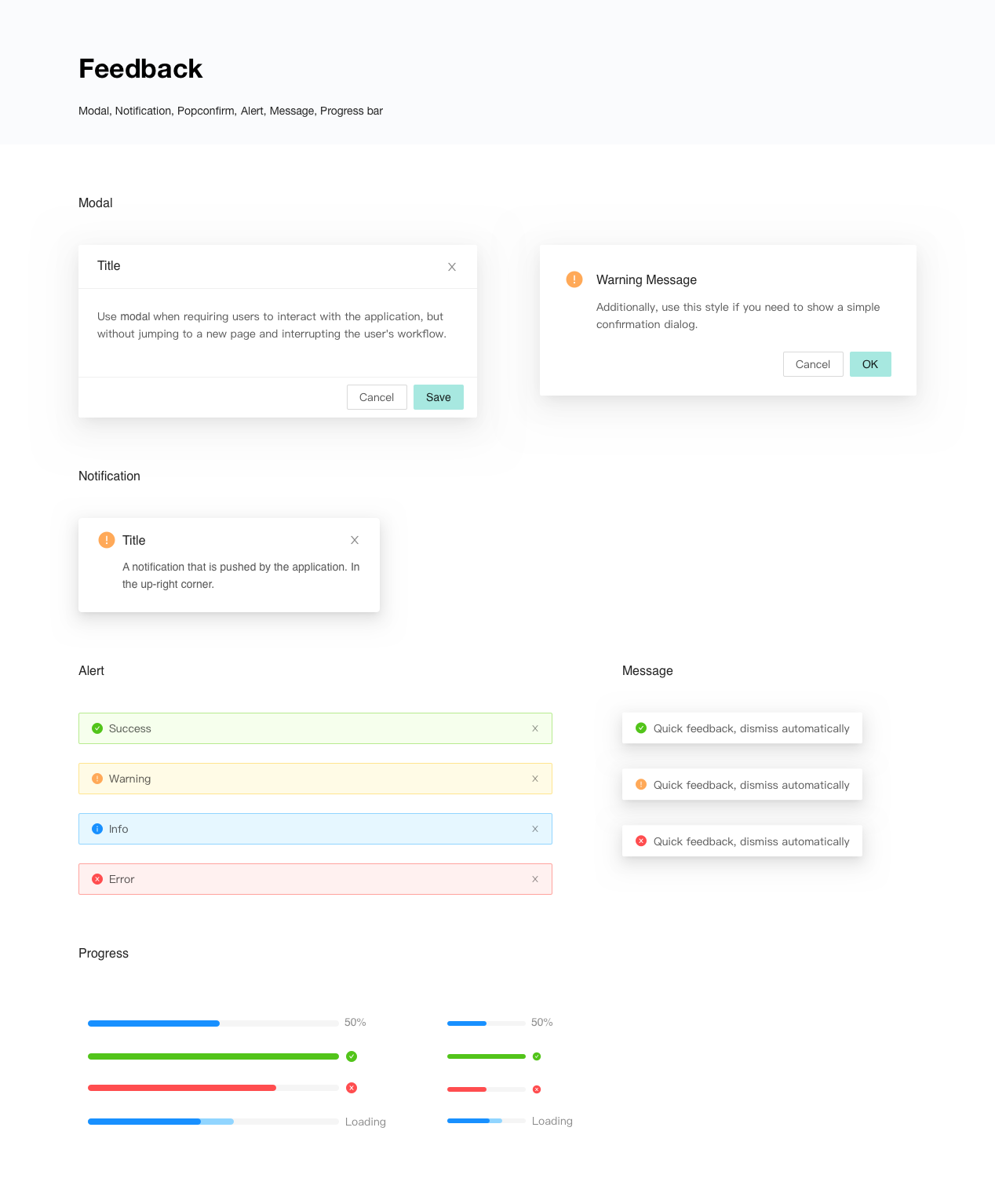
The team decided to go with the Raleway theme in the end, and then I went ahead to put together a Sketch library along with some documentation on when and how to use each comopent.
Some examples here, and many more : )
See it in action
I started to refer to the master Sketch symbols library throughout the design process while designing new features, realizing the efficiency of having those components handy and ready to roll.
Meanwhile, one dedicated engineer is working on the React component library based on each design specs. As a next step, we planned on creating an internal website to document the system that can be used by
both the engineers and designers.
both the engineers and designers.
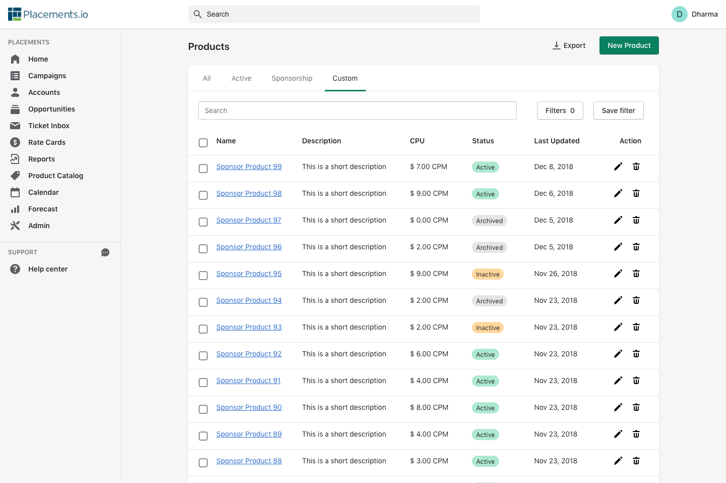
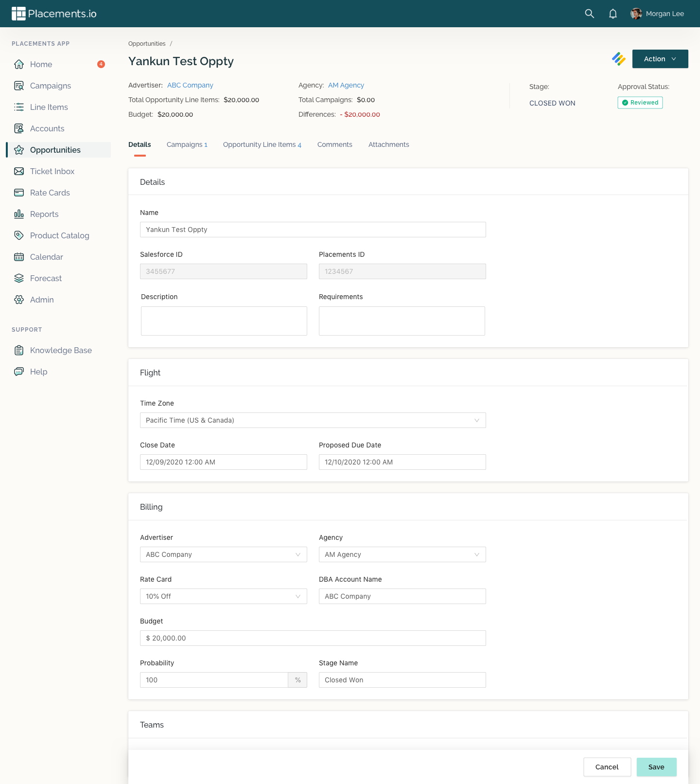
before
Object Detail Page
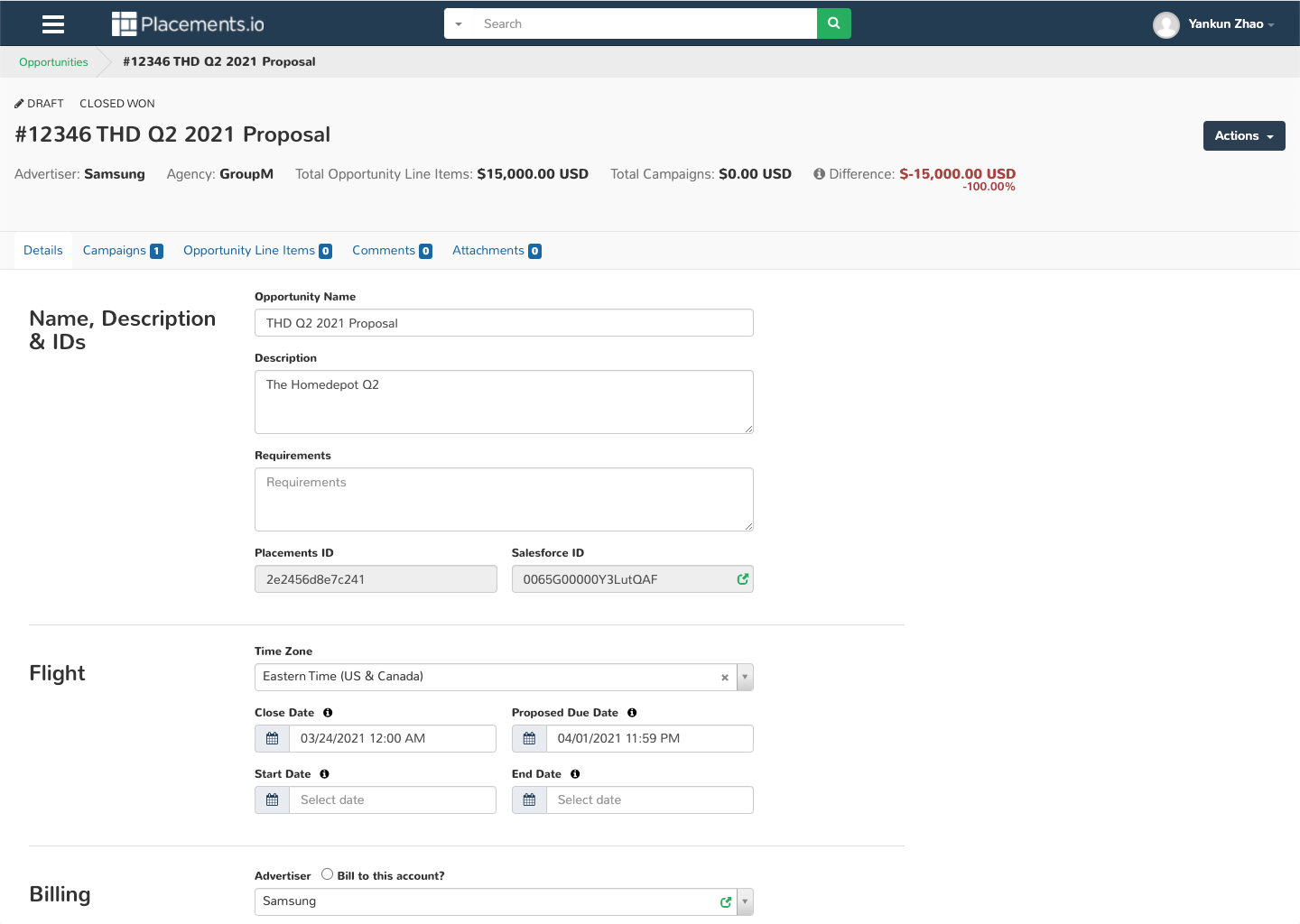
after
Object Detail Page
Before
Index Pages
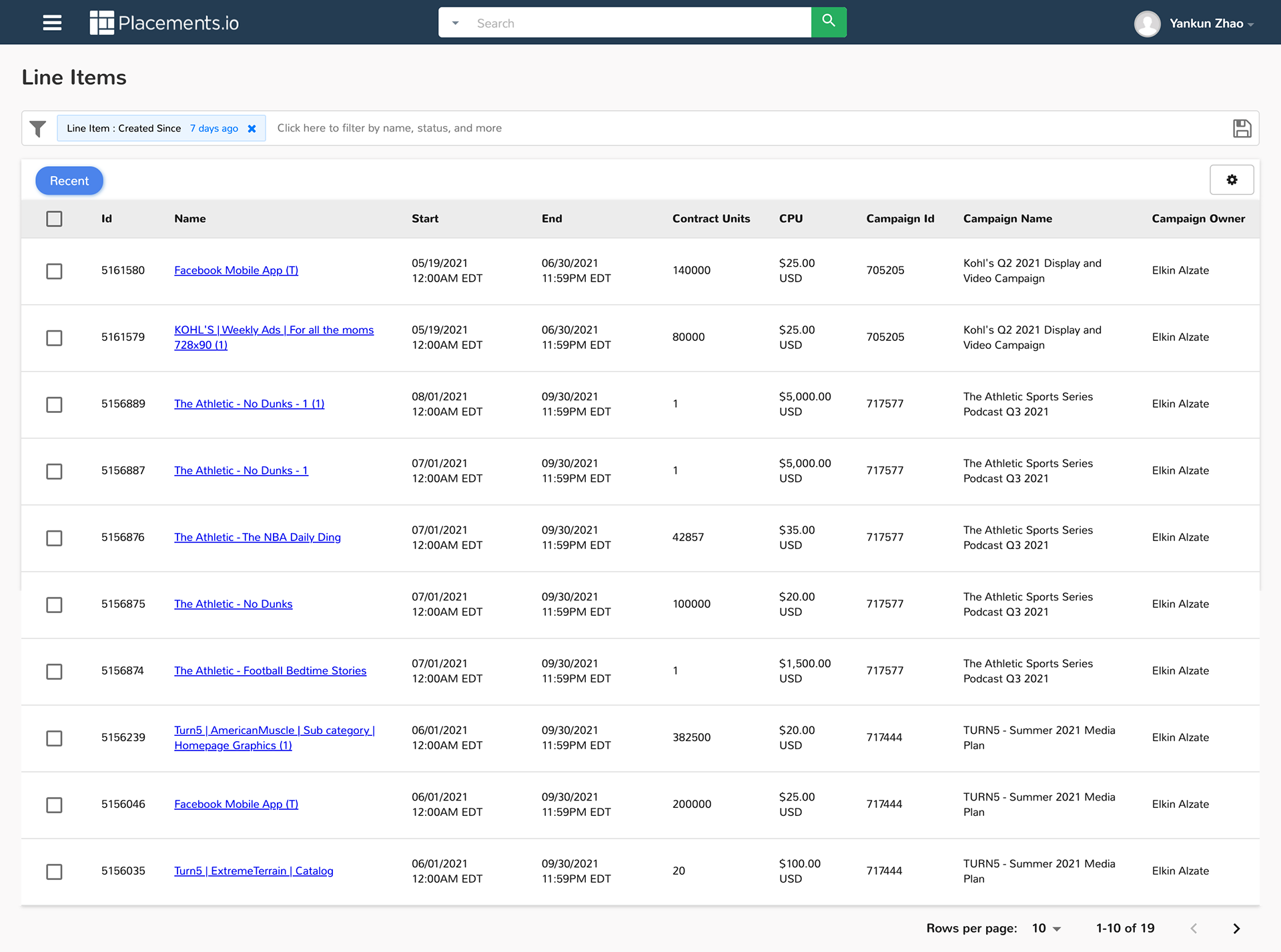
After
Index Pages

Before
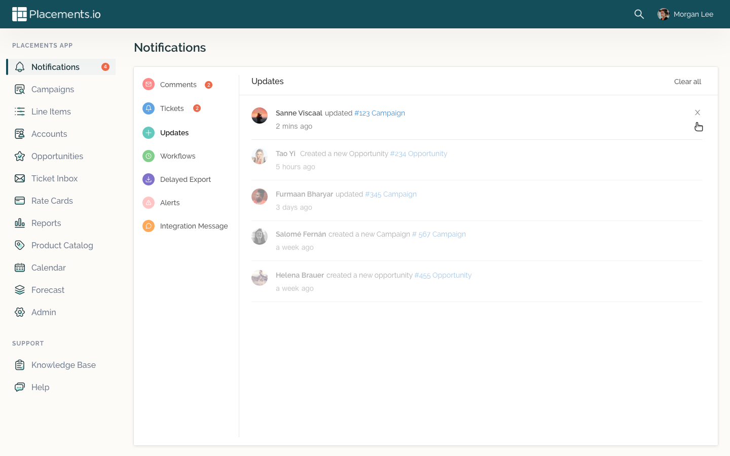
Notification Feed
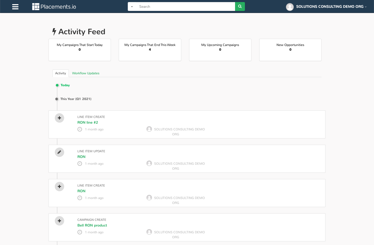
after
Notification Feed
Learnings
1. Take the initiative
We knew we needed a facelift and UI library for a long time, but always struggled to fit this into the roadmap since the work looks enormous. Later, we realized the team just need some motives to start, since we knew this is a problem we wanted to solve. So I decided to take the initiative, and proactively to generating something tangible to get things moving. The team showed their support right after seeing some results.
We knew we needed a facelift and UI library for a long time, but always struggled to fit this into the roadmap since the work looks enormous. Later, we realized the team just need some motives to start, since we knew this is a problem we wanted to solve. So I decided to take the initiative, and proactively to generating something tangible to get things moving. The team showed their support right after seeing some results.
2. Let the team feel involved
Although it felt like a designer-only project, I still try to send them updates and show some progress regularly. This helped people to feel involved and excited about the project. Collabration is the key for the success, and we need different opinions on the design.